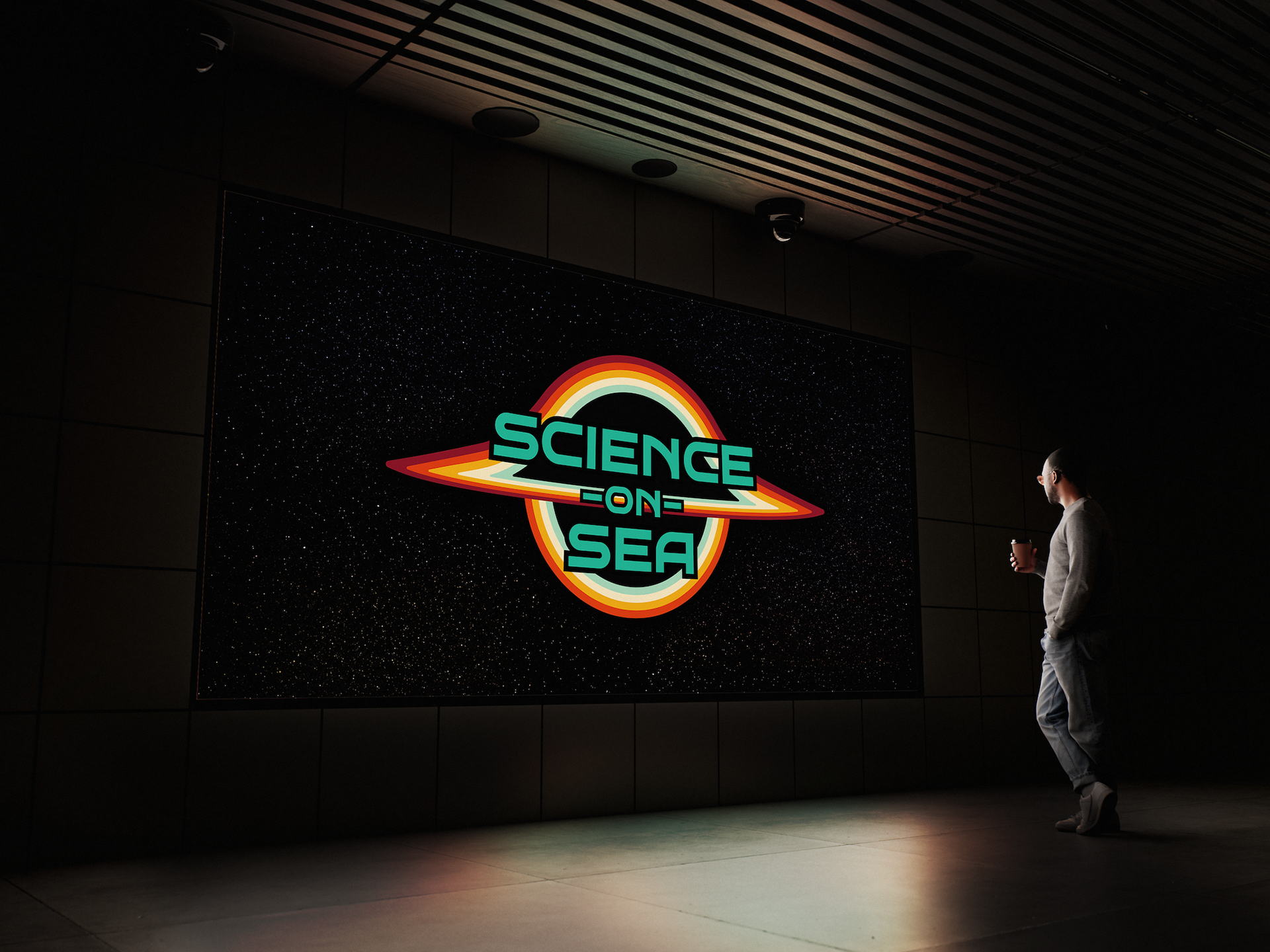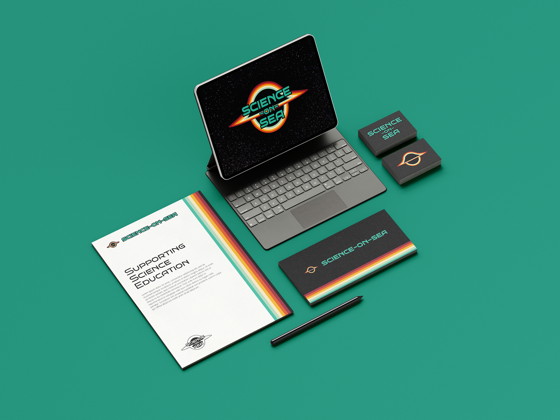
The brief was to create branding that showcased the style, tone and personality of Science-on-Sea.
The branding needed to be professional, but exciting and appeal to both adults and children.
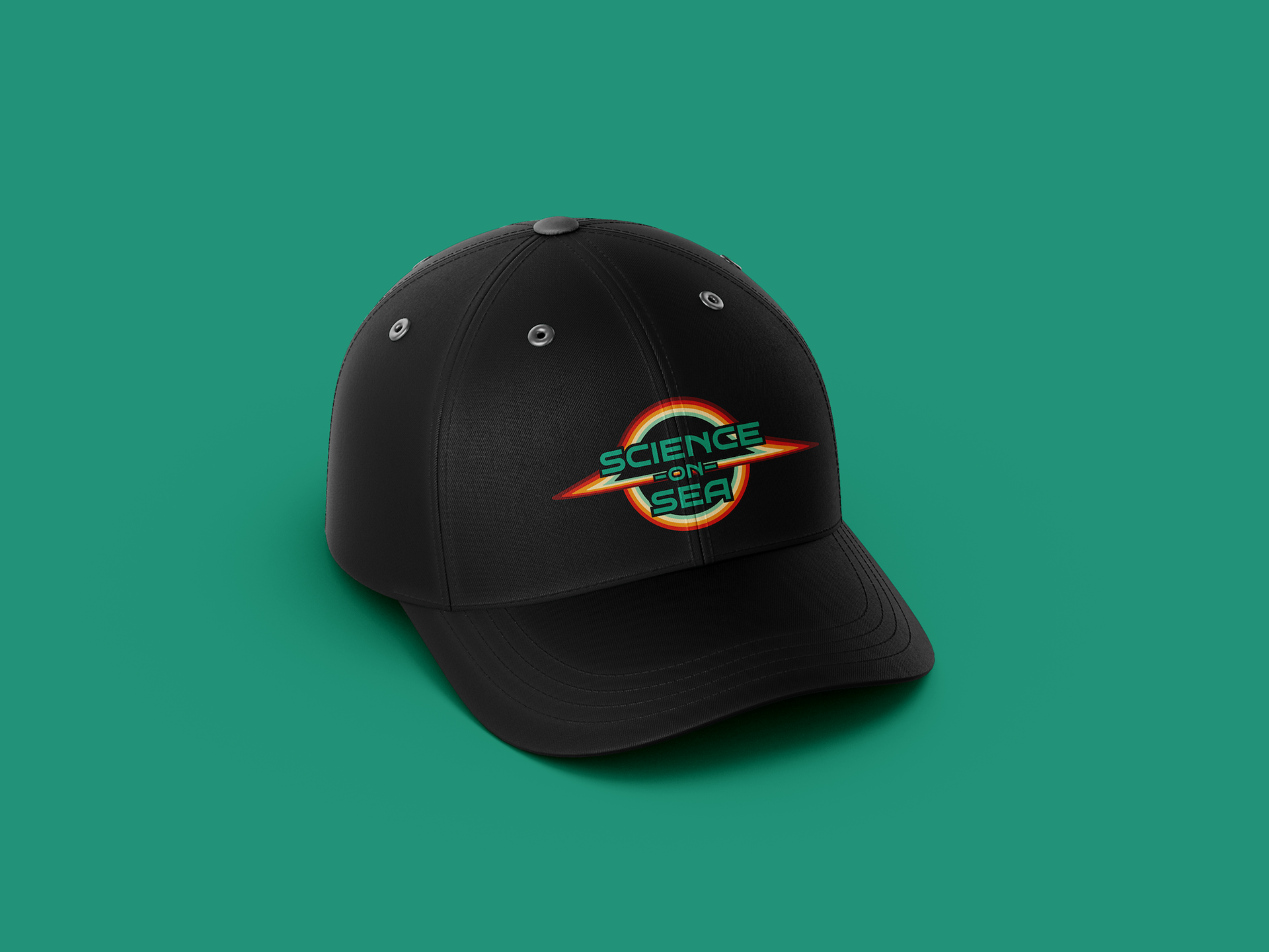
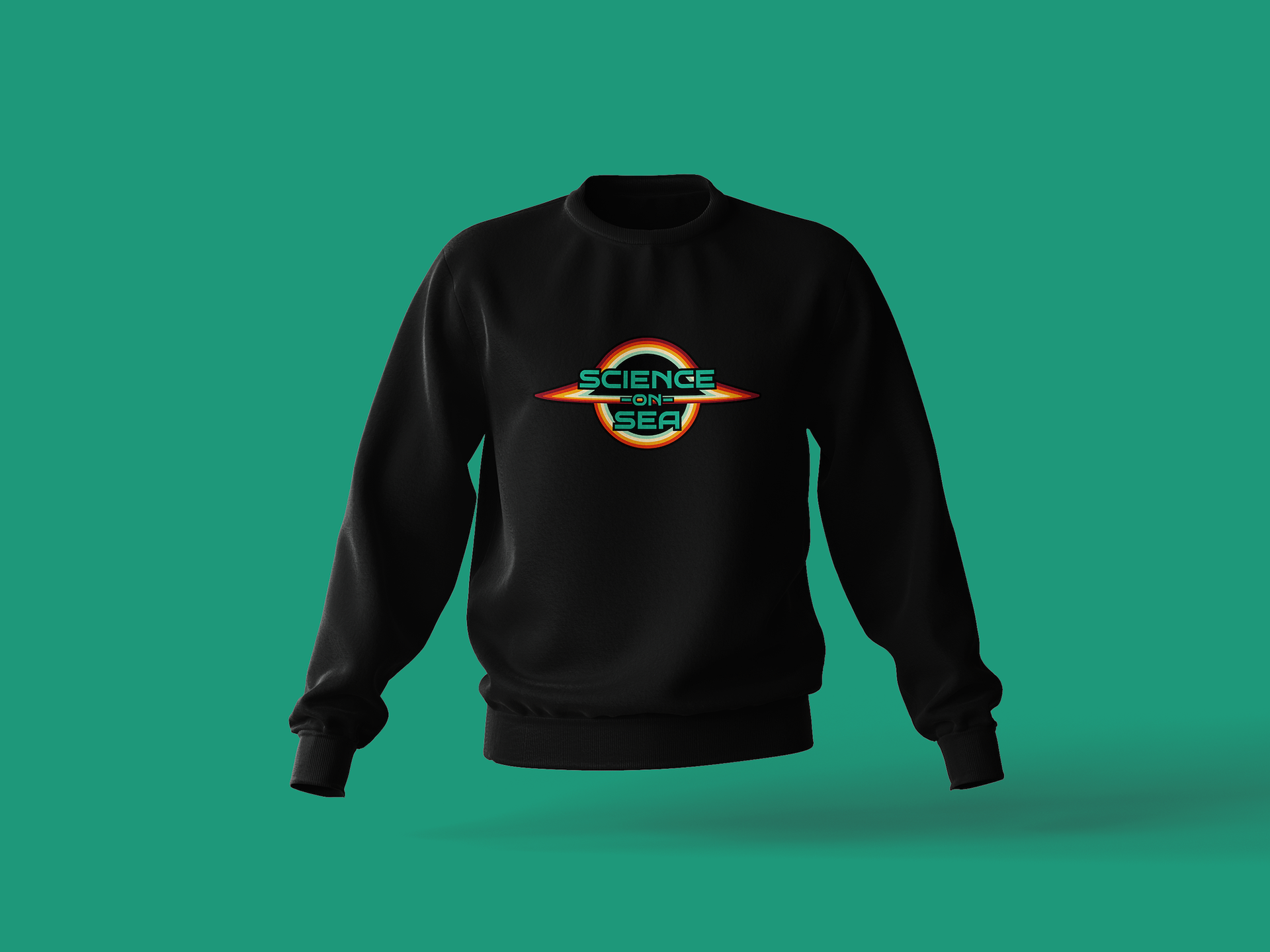
At the heart of Science-on-Sea's branding is the black hole - an instantly recognisable visual depiction of the sort of theoretical physics concepts Science-on-Sea explains.
The styling of the brand evokes a retro sci-fi feel: the hope, excitement and endless possibilities that science can bring for children and adults alike.
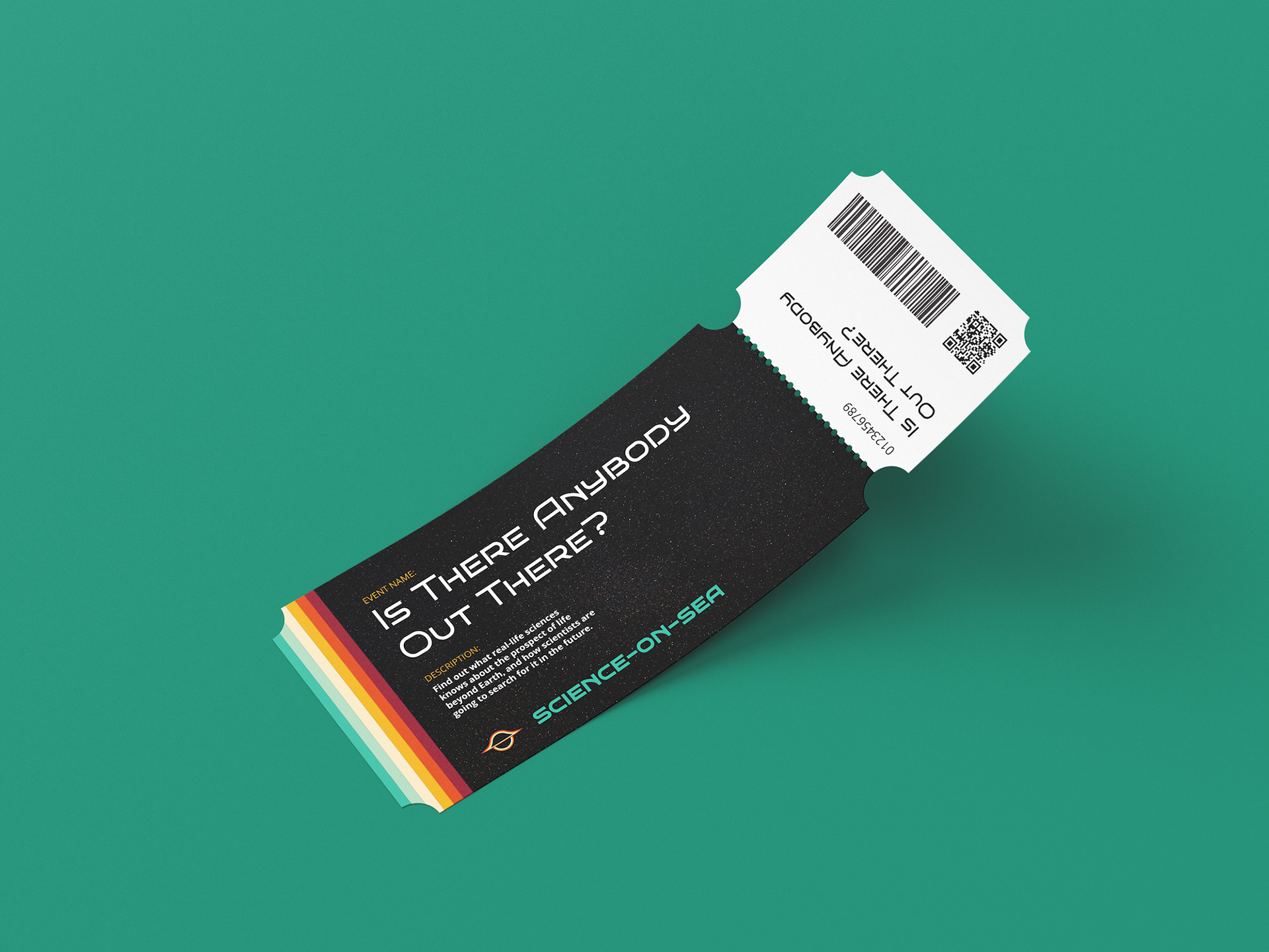
The stripes at the heart of the brand work well as the bands of light around the accretion disk of the black hole, inject colourfulness into the branding and create a versatile way to inject energy into the brand.
The header font of 'Bruno Ace' leans into the sci-fi feel, while the body font is Open Sans for a clear, legible, professional and precise feel.
"I cannot recommend Mike Bowker's design services highly enough. Despite coming to him with just the faintest whisps of an idea for my brand; he was able to zoom in on exactly what I was trying achieve.
From start to finish, I felt completely supported. His advice was clear, his communication was excellent, his billing was transparent, and not once during our meetings did I get the feeling we were 'on the clock'.
A wholehearted recommendation from a greatly appreciative customer. Thank you, Mike!"
~ Rob Clemenson, Owner of Science-on-Sea