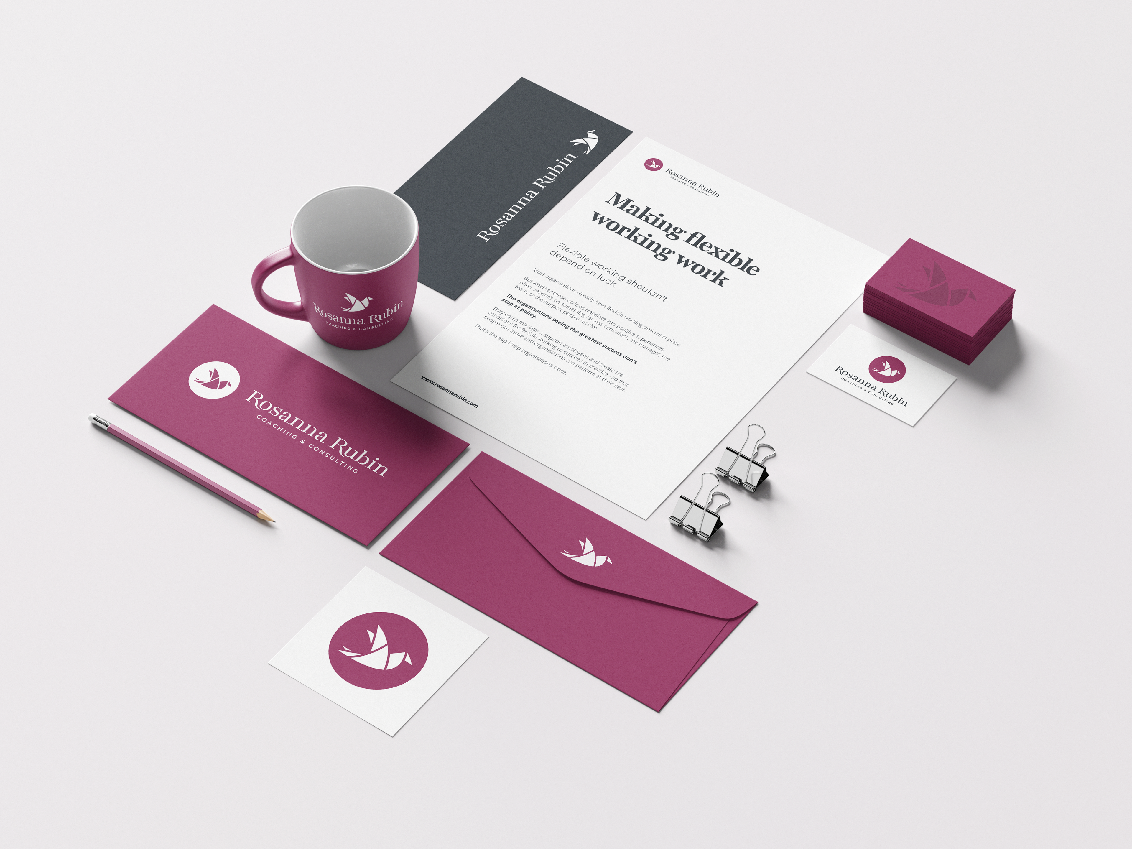
The brief was to create branding that reflected the professional, personal and thoughtful way she approaches her work.
This included logo and logo variations, colour palette and typefaces.
I chose a deep plum as the primary colour for the brand - warm but professional, stand-out but not garish.
The origami bird logo mark represents freedom she unlocks for her clients, while the origami illustrative style is a nod to the flexibility she enables.
This design also leaves the door open to future branding opportunities, rearranging the curved triangles into different positions, creating a range of bird icons in different stances (e.g. standing, looking back, aerial view flying etc)
The typeface used in the logo is a customised version of Playfair, which is also used in standard variants for headers. This is supported by Montserrat for sub-headers and callouts, and Open Sans as a body type for maximum legibility.
In addition to their aesthetic and technical qualities, all three typefaces were also chosen for being freely available, giving greater flexibility to the client.
"Mike really took the time to understand both me and my business, which made the whole process feel collaborative rather than transactional. He was honest, easy to work with, and created branding that feels completely authentic to me, while offering options that genuinely suited the stage my business is at."
~ Rosanna Rubin, founder