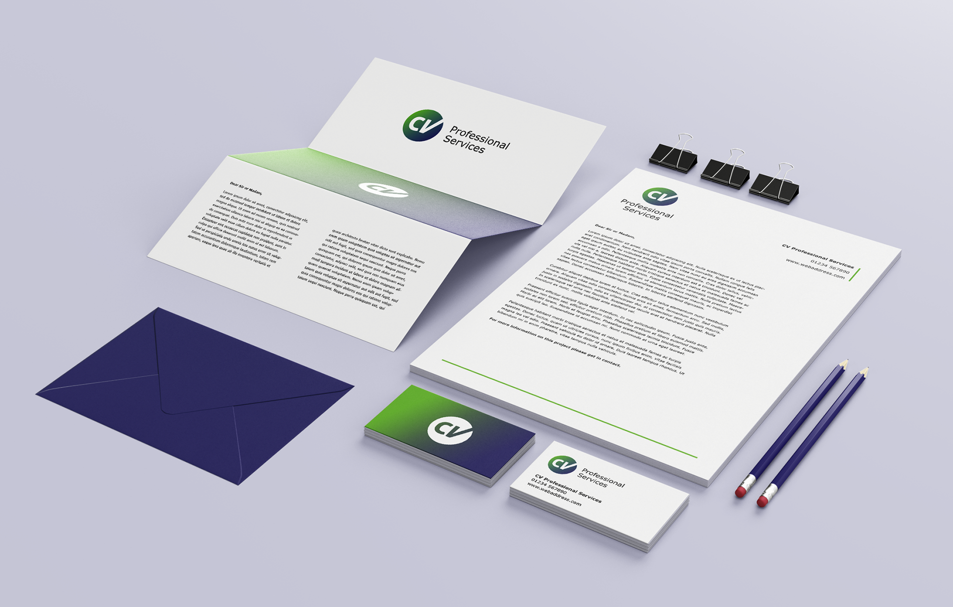
The brief was to create branding that reflected the professional nature of the business.
This included logo and logo variations, colour palette, typeface and a branded PowerPoint template.
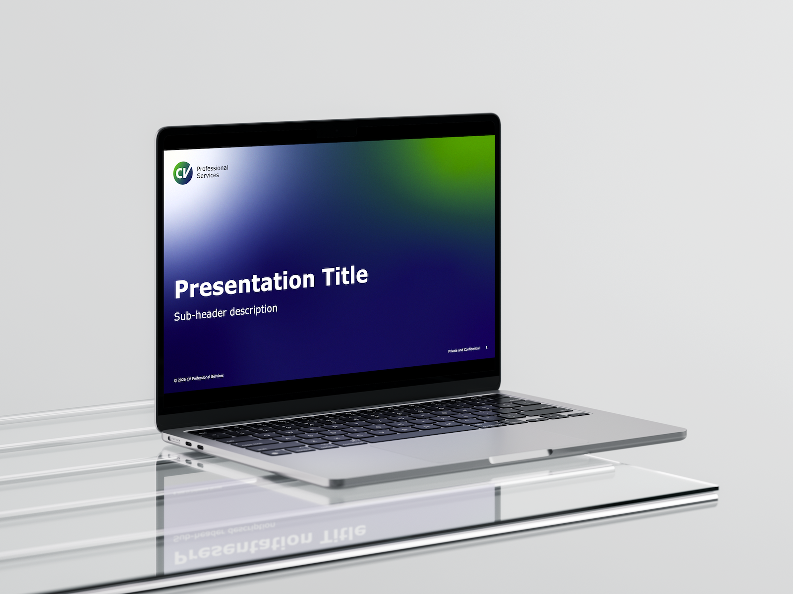
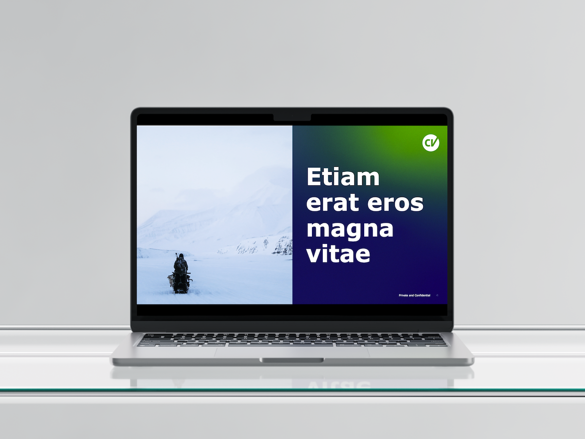
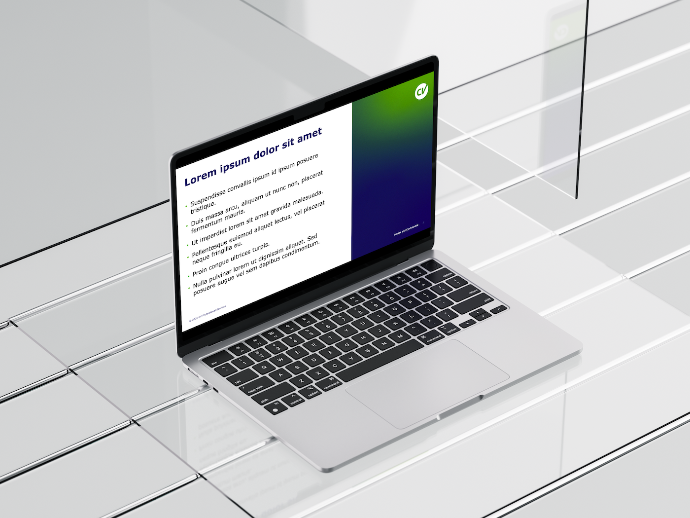
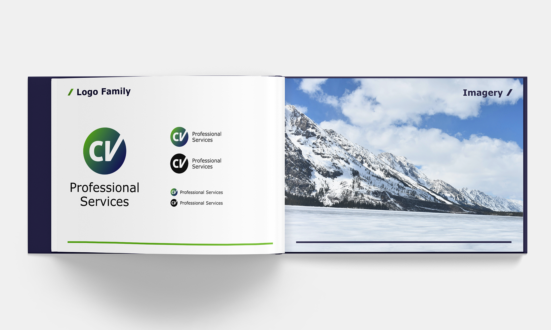
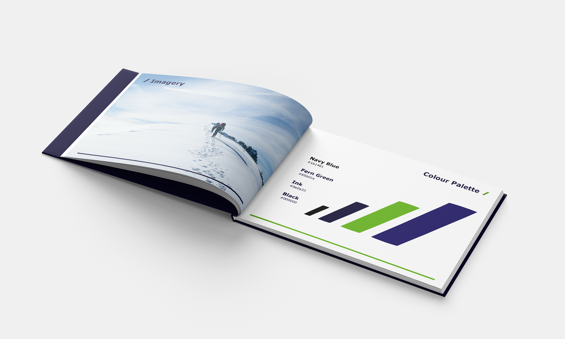
The client intuitively felt Blue and Green were the business' core colours. Pairing the two in a gradient brought the two together in a modern, premium and complementary style.
Verdana was chosen as the primary typeface. The client wanted a typeface that wasn't too extreme. The subtle curvature of Verdana was therefore the ideal choice, especially due to its excellent legibility and readability
Verdana's ubiquitous availability also gives the client greater flexibility to apply their branding across other mediums such as web and newsletter.
"Mike rapidly grasped the brief and understood how to blend professionalism and personality to develop our brand and templates. The speed, quality and cost of delivery were all excellent!"
~ Charles Vivian, Founder and MD, CV Professional Services
I designed the PowerPoint template to be ideally suited for clear, professional corporate and boardroom presentations.
The template slides were carefully designed to make sure the client doesn't need to spend their time formatting to make the presentation look good. They can instead focus on getting their expertise onto the slides.